Lifestyle · Culture
Calbee Scraps Black-and-White Chip Bags After Sales Slump
The Japanese snack giant's cost-saving packaging experiment reveals how deeply color psychology shapes consumer appetite across Asia's food markets
KEY TAKEAWAYS
- ·Calbee ended its black-and-white packaging trial after sales declined, with shoppers citing difficulty identifying flavors and reduced appetite appeal.
- ·The monochrome design stripped visual cues that trigger purchase impulses, particularly warm tones associated with snack indulgence in Asian retail environments.
- ·The reversal highlights the revenue risk of altering consumer-facing design in high-density Asian markets where instant shelf recognition drives impulse buying.
A Monochrome Miscalculation
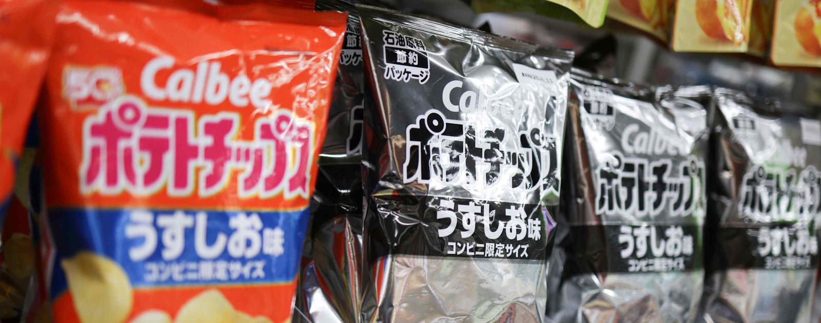
Japanese snack manufacturer Calbee has abandoned its black-and-white packaging initiative and restored full-color designs after weak sales demonstrated how profoundly visual cues influence consumer behavior in Asia's competitive food sector.
The company introduced monochrome packaging as an ink-reduction measure, but the cost-saving strategy backfired when shoppers struggled to distinguish between product varieties and reported diminished appetite appeal. Calbee announced it would return to traditional color schemes across its chip portfolio, acknowledging that packaging aesthetics directly impact purchase decisions in ways that override price considerations.
The Color Recognition Problem
Consumer feedback revealed a practical obstacle: the black-and-white bags made it difficult for shoppers to quickly identify flavors on crowded retail shelves. In Japan's convenience stores and supermarkets, where dozens of chip variants compete for attention in narrow aisles, the inability to spot familiar color codes at a glance proved a significant barrier.
Beyond mere identification, the monochrome design appeared to suppress the psychological triggers that make snack foods appealing. Color has long been understood to stimulate appetite responses, with warm tones like red, orange, and yellow associated with flavor intensity and indulgence. By stripping these visual signals, Calbee inadvertently dulled the sensory promise its products had traditionally conveyed.
Regional Implications for Packaging Strategy
The episode carries lessons for food brands operating across Asia, where packaging density and visual competition reach extreme levels. Tokyo's retail environment, with its high SKU counts per square meter, demands instant visual recognition. What works in less crowded Western grocery layouts may fail in the compressed, high-turnover format dominant from Seoul to Singapore.
Asian consumers have also shown particular sensitivity to packaging quality as a proxy for product freshness and brand care. The shift to black-and-white may have inadvertently signaled cost-cutting or diminished product standards, rather than environmental responsibility as intended. In markets where gift-giving and presentation matter, packaging remains a core component of perceived value.
The Economics of Visual Appeal
Calbee's reversal illustrates the delicate calculus between operational efficiency and consumer psychology. Ink costs represent a measurable line item; the revenue impact of reduced appetite appeal is harder to quantify until sales data arrives. The company's willingness to reverse course suggests the margin hit from lower volumes exceeded any savings from simplified printing.
The decision also reflects broader tensions in Japanese business between sustainability goals and commercial realities. Many manufacturers have explored packaging reduction initiatives, but few have tested such a dramatic visual overhaul on established product lines. Calbee's experience may prompt other brands to pursue less visible efficiency measures, such as lightweighting or recyclable materials, rather than altering consumer-facing design.
What Comes Next
The return to color packaging positions Calbee to recapture lost shelf presence and reinforce flavor differentiation. The company has not disclosed whether it will incorporate any of the cost-saving insights from the monochrome period, such as reduced ink coverage or streamlined graphics, into its refreshed designs.
For the broader Asian snack industry, the incident underscores that consumer perception remains the ultimate arbiter of packaging decisions. Brands pursuing sustainability or cost reduction will need to test initiatives carefully in limited markets before rolling out changes that alter the fundamental visual identity shoppers rely on to navigate crowded shelves and satisfy impulse cravings.
RELATED STORIES

Uniqlo Doubles Down on Flagship Stores to Revive Brand in Home Market
Cheng Wei-Lun · 3 min

Preferred Networks Eyes Public Listing to Scale AI Chip Production
Aiko Nakamura · 2 min

SoftBank Prices ¥1 Trillion Retail Bond in Largest Offering Since 2020
Aiko Nakamura · 3 min

Japan's August Exports Rise 19.3% on Semiconductor Demand
Aiko Nakamura · 3 min
Spot something wrong? Email editor@briefasia.com. We log every correction publicly.